Max Liebermann
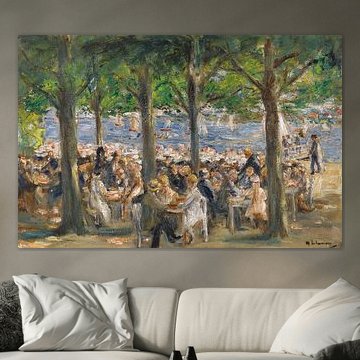
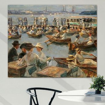
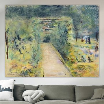
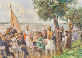
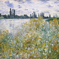
Max Liebermann captured the quiet beauty of everyday moments with remarkable sensitivity. His impressionist scenes, from sun-dappled gardens to lively riverside gatherings, bring warmth and nostalgia into your home. The soft greens, earthy browns, and gentle blues in works like Beer garden near the Havel under trees, Max Liebermann create a calm, inviting atmosphere that complements both classic and contemporary interiors.
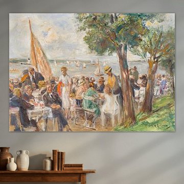
At Art Heroes, we craft each piece to order. Choose from Canvas, Poster, ArtFrame™, Wallpaper and more to suit your space.
-
More artworks below this tip
Layer green shades for depth
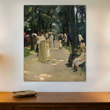
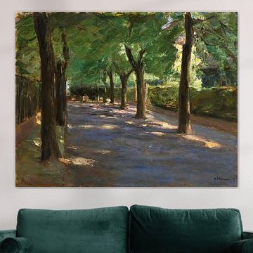
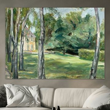
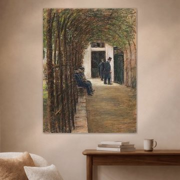
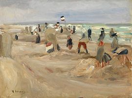
Combining different green tones adds visual interest without clashing. If your space already features sage or olive textiles, the emerald and earthy green hues in Boulevard of the Parrots, Max Liebermann introduce contrast while staying within the same natural colour family.
KatharinaStylist & Customer service Questions? Check out our FAQ


Trusted and loved
Customers rate us 4.8!
High-quality materials
Sustainable and long-lasting beauty
Different sizes
From small to large, anything is possible.
Made for you
Made the moment you order.


More like this

Where works by Max Liebermann shine in your living room
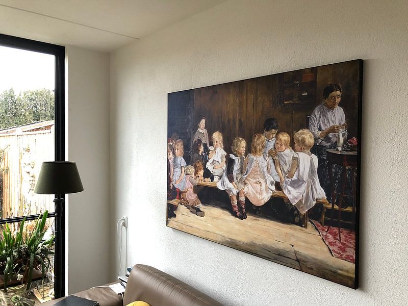
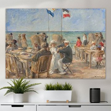
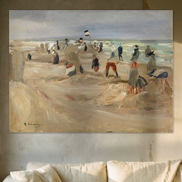
Art from the Max Liebermann collection works beautifully in a living room setting. The warm earth tones and calm compositions create a welcoming atmosphere above a sofa or sideboard. These artworks bring a sense of history and craftsmanship to your space without overwhelming it. Consider placing them where natural light falls gently, as this brings out the subtle brushwork and tonal depth that define this style of painting.
Styling Max Liebermann with classic or country interiors
The brown, beige, taupe, and olive green palette in Max Liebermann artworks pairs naturally with classic or country interior styles. Combine these earthy tones with wooden furniture and warm textiles for a cohesive look. In a classic setting, the greens and browns echo traditional design elements, while country interiors benefit from the nostalgic, grounded feel of these colors. Beige and taupe shades work particularly well as a bridge between darker wood tones and lighter walls.
Combining Max Liebermann art with calm, nostalgic decor
The calm and nostalgic moods in Max Liebermann artworks make them easy to pair with joyful decorative accents. Create a gallery wall by mixing different formats, or combine a single larger piece with natural materials like linen throws and ceramic objects. Plants with soft foliage complement the olive and green tones beautifully, while vintage brass or wooden frames add character. These artworks suit spaces where you want to encourage reflection and quiet enjoyment. Choose Canvas to highlight the painterly quality and bring an authentic feel to your walls.
