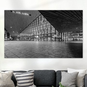
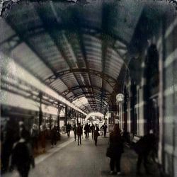
Rotterdam Central Station
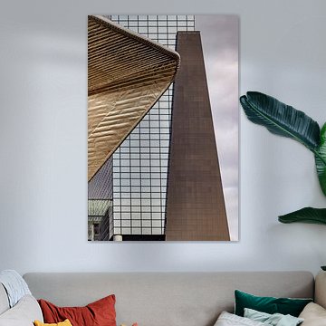
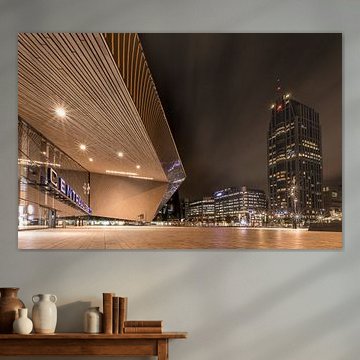
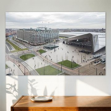
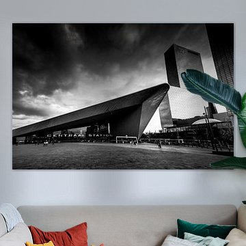
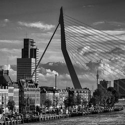
Rotterdam Central Station stands as one of Europe's most striking pieces of modern architecture. Its dramatic sloped roof and bold geometric lines have inspired photographers and artists to capture its character from countless angles. Whether you're drawn to the warm tones of daylight or the cool glow of evening, these artworks reflect the station's vibrant energy and contemporary design. Works like Rotterdam Central Station showcase the building's distinctive silhouette, often nicknamed 'Station Salon' for its resemblance to an aluminum container.
At Art Heroes, we print your chosen piece to order. Choose Canvas, ArtFrame™, Poster and more to suit your space.
-
More artworks below this tip
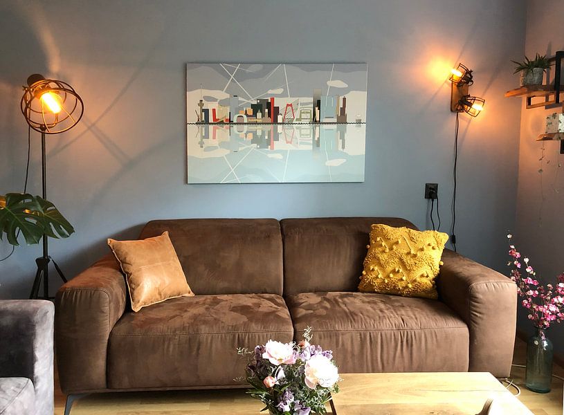
Pairing with your room
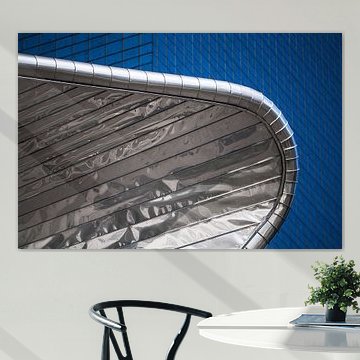
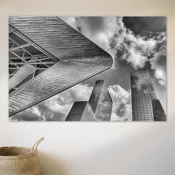
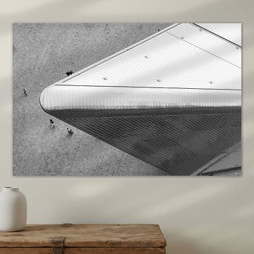
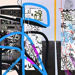
Architectural photography works well in spaces where clean lines matter. The angular metallic structure in Rotterdam Modern Series I suits modern living rooms or home offices with contemporary furniture. Its monochrome palette with a subtle cyan tint complements minimalist interiors without competing for attention.
EileenStylist & Customer service Questions? Check out our FAQ
 -
More artworks below this tip
Working with blue tones
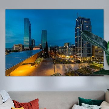
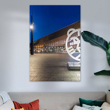
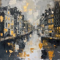
Deep blue evening skies create a calm backdrop in urban scenes. The twilight atmosphere in Central Station pairs naturally with warm interior lighting and wooden furniture. Try combining these cooler blue tones with beige or taupe accents to balance the palette in your space.
LianneStylist & Customer service Questions? Check out our FAQ
 -
More artworks below this tip
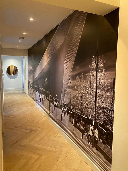
Placement for twilight scenes
Evening cityscapes gain impact when hung where natural light changes throughout the day. Place Rotterdam central station on a wall that catches afternoon or evening light - the soft pink and blue hues in the sky will shift beautifully as daylight fades, echoing the twilight moment captured in the photograph.
AnouschkaArt Stylist Questions? Check out our FAQ


Trusted and loved
Customers rate us 4.8!
High-quality materials
Sustainable and long-lasting beauty
Different sizes
From small to large, anything is possible.
Made for you
Made the moment you order.


More like this
Choosing the right material for Rotterdam Central Station art
Rotterdam Central Station comes to life on each of our premium materials. Whether you choose ArtFrame™, Canvas, or Poster, each enhances the unique architectural details and bold colors.
Choose ArtFrame™ and you benefit from two standout features. First, the interchangeable print system lets you refresh your Rotterdam Central Station artwork whenever you want - simply swap the print in under five minutes without replacing the entire frame. The aluminum frame comes in gold, black, white, or silver, so you can match it to the blue, grey, and brown tones often found in Rotterdam Central Station imagery. Second, ArtFrame™ offers an optional acoustic function that reduces echo and reverberation. This makes it ideal if your Rotterdam Central Station piece hangs in a home office or open-plan living space where sound control matters. The sound-dampening panels fit invisibly behind the print and are made from recycled materials, combining visual impact with practical comfort.
Still doubting which material suits your interior and chosen Rotterdam Central Station artwork? Use our material comparator to find the perfect match.
How to style Rotterdam Central Station prints in your home
Rotterdam Central Station artworks range from calm architectural studies to vibrant urban scenes and mysterious night photography. Pair a vibrant daytime station photograph with quieter, monochrome city prints to create a balanced gallery wall in your hallway or living room. The blue and grey tones work beautifully alongside natural materials like oak shelving or linen textiles. Add a potted monstera or eucalyptus branch to soften the urban energy and bring warmth to the composition. Mix portrait and landscape formats for visual rhythm and depth.
Which format works best for Rotterdam Central Station art
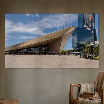
Rotterdam Central Station looks striking in landscape format, which mirrors the sweeping lines and horizontal structure of the station itself. Hang a wide landscape print above your sofa, sideboard, or dining table to emphasize the architectural grandeur and create a strong focal point. If you're working with a narrow wall or want to highlight vertical columns and light, a portrait format works better - try it in a hallway or beside a bookshelf. Square formats suit smaller walls or gallery arrangements where you want symmetry and balance.
