


Buy the photo Japanese fan maple Murasaki Kiyohime maple by Mixed media vector arts on canvas, ArtFrame, poster and wallpaper, printed on demand in high quality.
About "Japanese fan maple Murasaki Kiyohime maple"
by Mixed media vector arts
About the artwork
The picture shows a close-up of the bright red leaves of a Japanese fan maple. The characteristically lobed leaves are arranged close to the branches and form an almost graphic-looking structure. The deliberate blurring in the background emphasises the intense red of the leaves and draws the eye to the fine details of the leaf veins and edges.
The inspiration for this work was the intense autumn colouring of the maple, which has an almost meditative effect in its clarity and density. I was interested in how natural forms can be transformed into a visual composition through light and perspective - without artificial staging.
The atmosphere I want to create with this picture is calm but present. It is about concentrating on the essentials, about the power of colour and form in a natural context. The message is simple: nature needs no amplification - it speaks for itself.
In interior design, this picture acts as a powerful colour accent. In pared-down, light-coloured rooms in particular, it can serve as a counterpoint that adds warmth and structure. The combination of natural intensity and clear composition makes it versatile - from living rooms to modern working environments.

About Mixed media vector arts
I'm generally not the type of person who has a lot to say about herself. Not even about my work in graphics and illustrations. It should be obvious, that I don't like to stand still in terms of style and content, but want to explore everything. If you.. Read more…
 Autumn
 Forest
 Joyful Moments
 Macrophotography
 Nature and weather
 Photo wallpaper
 Photography
 Plants
 Trees
Trees Vibrant Colors
 Germany
 Ordered in November 2020
Germany
Ordered in October 2024
Ordered in November 2020
Germany
Ordered in October 2024
 Netherlands
 Ordered in September 2025
Netherlands
Ordered in May 2025
Netherlands
Ordered in September 2025
Netherlands
Ordered in May 2025
Netherlands Ordered in May 2020
Germany
Ordered in February 2021
Germany
Ordered in May 2019
Germany
Ordered in September 2021
Germany
Ordered in June 2022
Germany
Ordered in September 2023
Germany
Ordered in December 2019
Netherlands
Ordered in May 2019
Ordered in May 2020
Germany
Ordered in February 2021
Germany
Ordered in May 2019
Germany
Ordered in September 2021
Germany
Ordered in June 2022
Germany
Ordered in September 2023
Germany
Ordered in December 2019
Netherlands
Ordered in May 2019
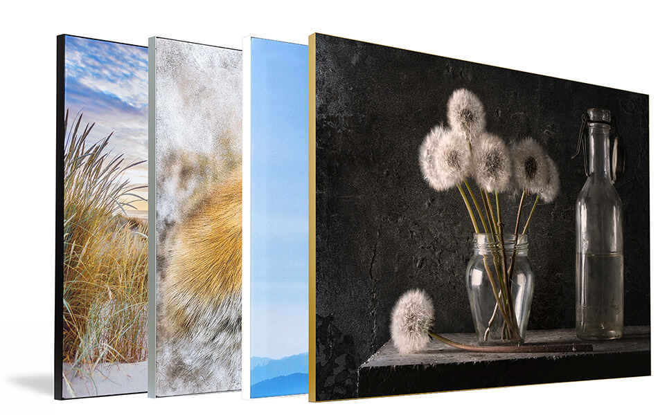
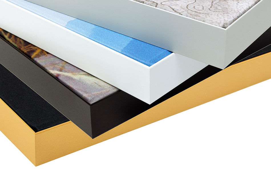
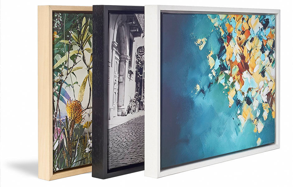
About the material
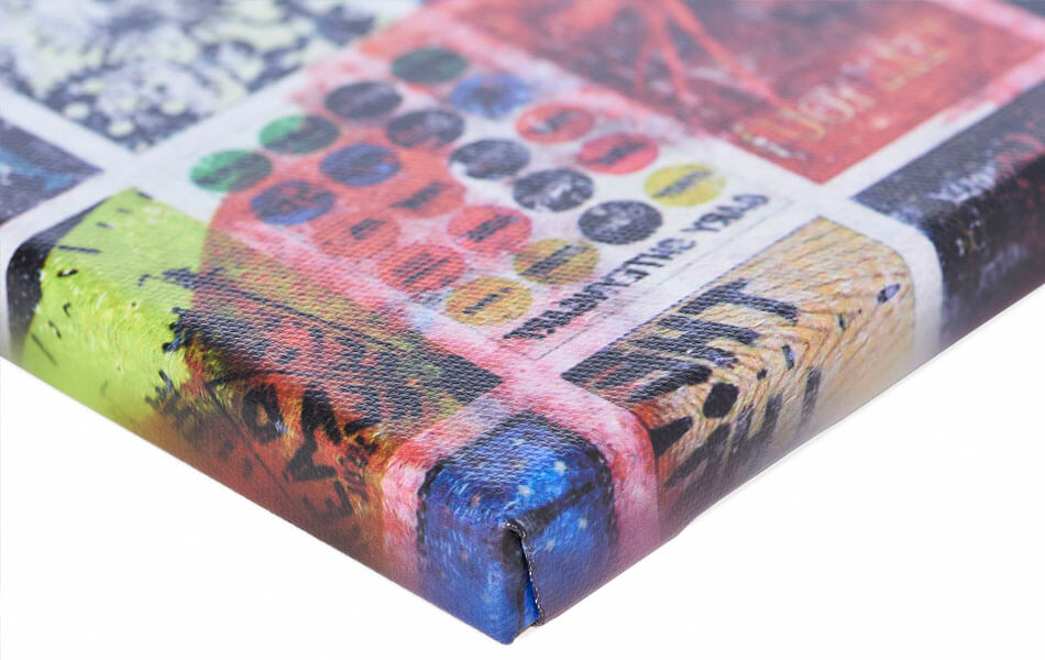
ArtFrame™
Interchangeable Art Prints
- High-quality print
- Easily interchangeable
- Acoustic function
- Large sizes available
Discover the artworks of Mixed media vector arts
 DanseMixed media vector arts
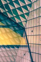 Architectural Detail - Berlin FuturiumMixed media vector arts
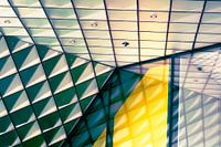 Detail of abstract glass patterns from postmodern architecture in BerlinMixed media vector arts
 Circular movement in blue and red on greyMixed media vector arts
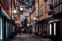 Erfurt Krämerbrücke at ChristmasMixed media vector arts
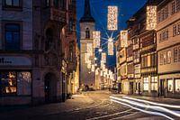 Erfurt Marktstraße at ChristmasMixed media vector arts
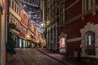 Erfurt Krämerbrücke at ChristmasMixed media vector arts
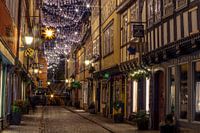 Erfurt Krämerbrücke at ChristmasMixed media vector arts
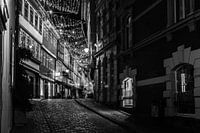 Erfurt Krämerbrücke at Christmas black and whiteMixed media vector arts
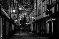 Erfurt Krämerbrücke at Christmas black and whiteMixed media vector arts
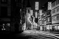 Erfurt Marktstraße at Christmas black and whiteMixed media vector arts
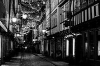 Erfurt Krämerbrücke at Christmas black and whiteMixed media vector arts
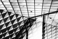 Glass façade at Futurium Berlin black and whiteMixed media vector arts
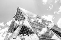 3XN Cube Berlin black and whiteMixed media vector arts
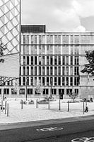 Federal Ministry of Education and Research BerlinMixed media vector arts
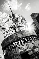 World Time Clock and Berlin Television Tower in summerMixed media vector arts
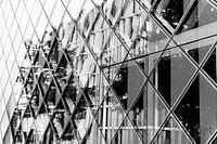 Glass façade at Futurium BerlinMixed media vector arts
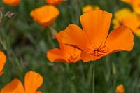 Golden poppy - California poppyMixed media vector arts
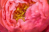 Perennial peony - Paeonia officinalisMixed media vector arts
 Interwoven silence - light and fabric in dialogueMixed media vector arts


