

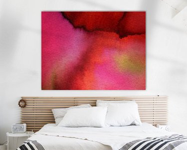

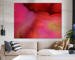
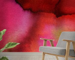
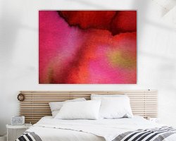
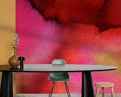
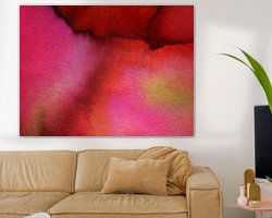
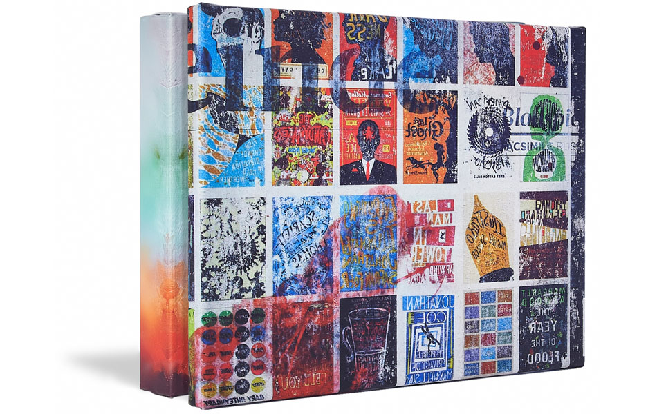
Buy this painting The red lake - acrylic ink painting by studio esther walter as a reproduction on canvas, ArtFrame, poster and wallpaper, printed on demand in high quality.
About "The red lake - acrylic ink painting"
by studio esther walter
About the artwork
At my studio, I like to create unique work on paper. I trust my intuition and let go of the outcome. I am also guided by chance and a limited choice of colours.
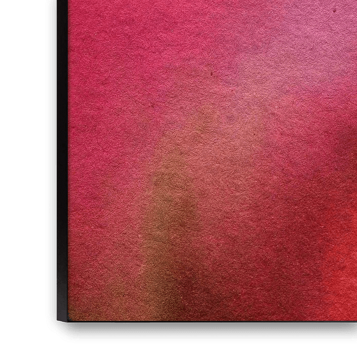
This image reminds me of Lake Como in northern Italy. As if floating above the lake and looking down on the water, in which different colours reflect. Red, orange, pink, purple but also green tending towards gold. At the top of the image, dark red lines seem to form the beginning of the shore. So it looks like the mountains disappearing into Lake Como. The bright, deep colour suits are catchy. And despite being so exuberant, the image gives me peace.
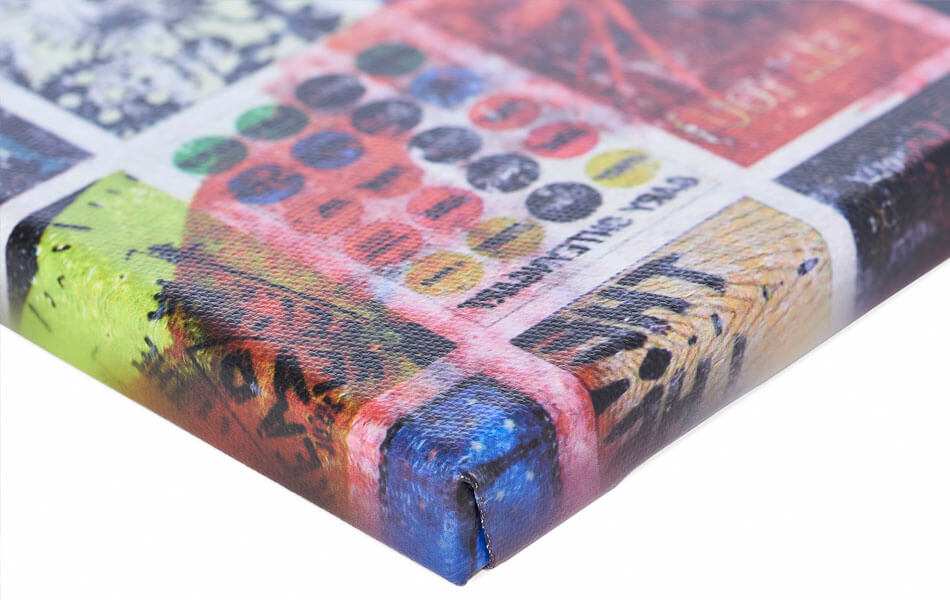
Because I had the inks mixed on paper and blended into each other, you see many different transitional colours. Very occasionally, up close, you also see minute 'dots' of accumulated dust and ink; the original remains handmade work. But never disturbing.
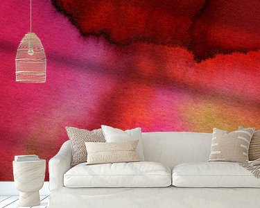
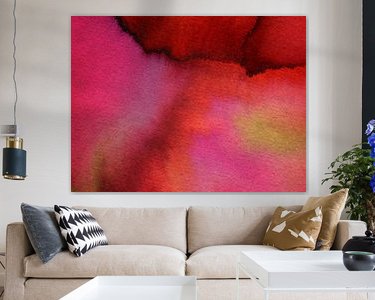
This work gives your wall the warm and original look you are looking for. I imagine this work above a red armchair or above your bed.
This work is a cut-out from a handmade watercolour. From the same work, I have three more cut-outs available. Perfect to combine!

About studio esther walter
After graduating from the Rietveld Academy, I started working as a freelance visual artist in 2012. I mostly make graphic and illustrative expressions, but when my schedule permits, I prefer to make autonomous art. Which I share with you here!.. Read more…
 Lakes
Lakes Mountains
 Nature and weather
 Powerful Expression
 Vibrant Colors
 Watercolour
 Germany
 Ordered in November 2019
Germany
Ordered in March 2019
Germany
Ordered in July 2020
Ordered in November 2019
Germany
Ordered in March 2019
Germany
Ordered in July 2020
 Netherlands
 Ordered in October 2020
Germany
Ordered in March 2023
Netherlands
Ordered in October 2020
Germany
Ordered in March 2023
Netherlands Ordered in February 2023
Germany
Ordered in November 2020
Netherlands
Ordered in August 2019
Germany
Ordered in February 2021
Netherlands
Ordered in July 2025
Germany
Ordered in July 2025
Netherlands
Ordered in November 2020
Ordered in February 2023
Germany
Ordered in November 2020
Netherlands
Ordered in August 2019
Germany
Ordered in February 2021
Netherlands
Ordered in July 2025
Germany
Ordered in July 2025
Netherlands
Ordered in November 2020
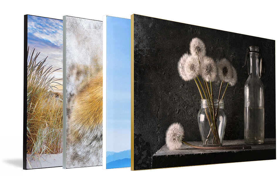
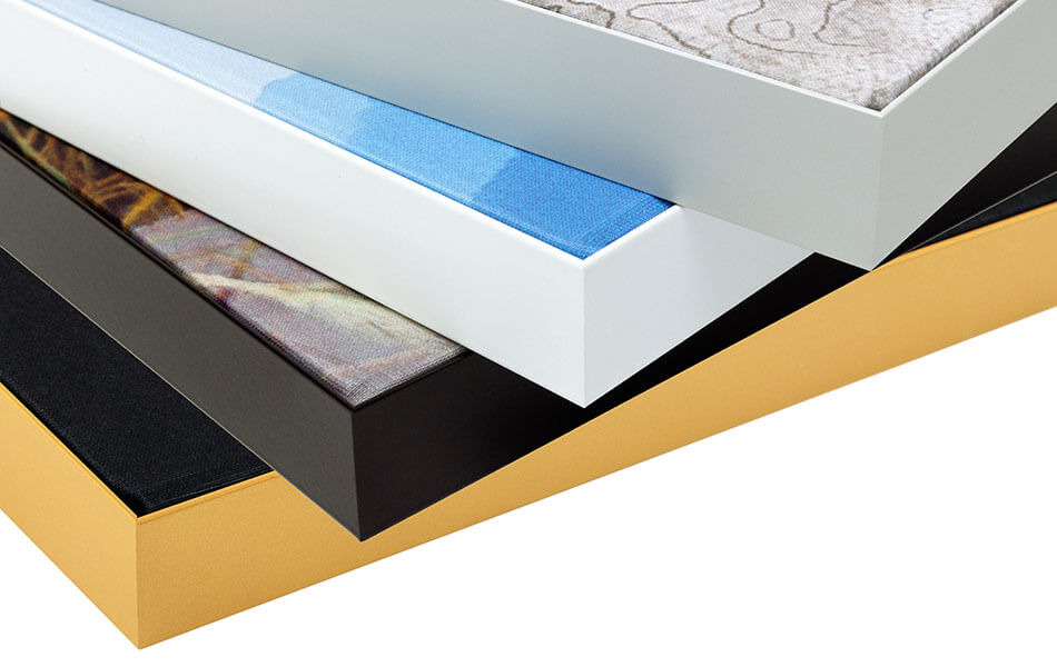
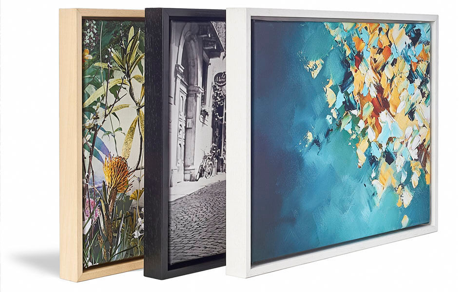
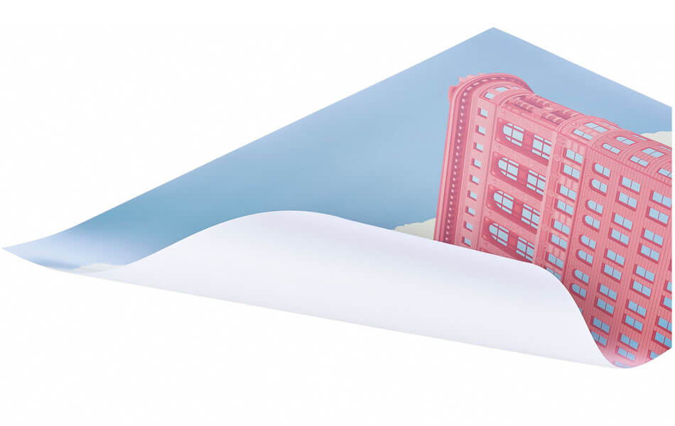
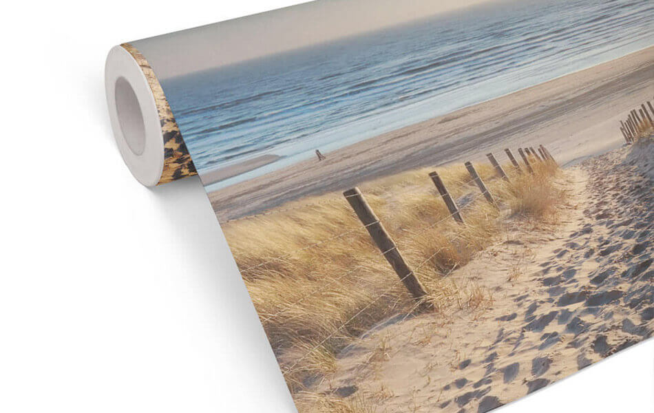
About the material
ArtFrame™
Interchangeable Art Prints
- High-quality print
- Easily interchangeable
- Acoustic function
- Large sizes available
Discover the artworks of studio esther walter
 Evening red - acrylic ink paintingstudio esther walter
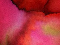 The red lake - acrylic ink paintingstudio esther walter
 Northern lights - acrylic ink paintingstudio esther walter
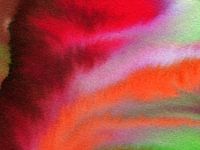 Fantasy sky - watercolour or acrylic ink paintingstudio esther walter
 A fresh dip - handmade watercolour paintingstudio esther walter
 Summer on the island - handmade watercolourstudio esther walter
 Butterflies in my stomach - detail of a watercolour - painting from acrylic ink on paperstudio esther walter
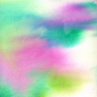 Dreamy - detail of an acrylic ink painting on paperstudio esther walter
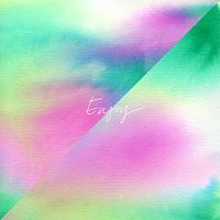 Enjoy - two cut-out watercolours with affirmationstudio esther walter
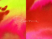 Pleasure - digital assemblage of two unique watercoloursstudio esther walter
 Flowers in the windstudio esther walter
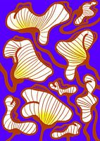 African flowers in the windstudio esther walter
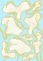 Boy's flowersstudio esther walter
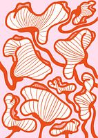 Girl's flowersstudio esther walter
 Merry Christmas - Neonstudio esther walter
 OK, NEXT YEAR, PLZstudio esther walter
 Easter egg hunt - original digital drawingstudio esther walter
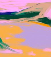 The lake - original digital drawingstudio esther walter
 Summer Walk - digital sketchstudio esther walter
 Denmark - original digital drawingstudio esther walter


